The Forgiving User Interface

   
Recent changes
Table of contents
Links to this page
FRONT PAGE / INDEX

Subscribe!
@ColinTheMathmo

My lastest posts can be found here:
Previous blog posts:
Additionally, some earlier writings:

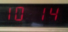
The Forgiving User Interface - 2011/04/05

Recently as I was changing the time on the radio alarm clock in my bedroom to make the adjustment for British Summer Time, I was struck by the placement and labelling of the buttons. For years I have found myself pressing the wrong buttons, and thinking I'm just stupid (or at least, half asleep). But I had a closer look and was a little surprised at what I found. Let me show you ...

So here I have a picture of the time. There's nothing special about this, it's just a standard, 24-hour digital clock. Notice, however, that the hours are on the left, and the minutes are on the right. I suspect that will come as no great surprise to you. images/TimeDisplay.jpg

Here we have the buttons used to adjust the time. To change the time, you hold down the "Time" button, and to change the time of the alarm, you hold down the "Alarm" button. I suspect that this will also come as no surprise to you. images/TimeAlarmSet.jpg

Then while holding down your chosen button, you additionally press the hour button to advance the hours by one, and the minute button to advance the minutes by one. Holding down your chosen hour or minute button will see it auto-advance. And, once again, this will (most likely) come as no surprise to you. images/Hours.jpg
images/Minutes.jpg
Here, let me show you the buttons in all their glory.


images/FullPanel.jpg

Hmm - hang on a minute. Why is the minute button on the left, and the hour button on the right?

Well, I have no idea.

images/LiftFloors.jpg
But this somehow reminded me of the sign I saw recently in a lift (or elevator, if you prefer) in a hotel. It listed the floors, and the rooms to be found on each one. I didn't get a photo at the time, but here's one I took a little later:

It struck me. Why are they listed in an order opposite to how they actually occur in space? Why is the lowest floor at the top, and the uppermost floor at the bottom? (And why does one not say "lowermost" And or "uppest"?)

Well, you got me again. I have no idea. At least it doesn't really matter in this case - I won't press the wrong button.

The Elevator Button Problem
But that also put me in mind of an article I read a while ago about how the correct operation of the buttons on a lift is actually a cultural thing. The lift car is currently above me, I want to travel up, I need to command the lift to come down to me, so I press the "Down" button.

No. I press the "Up" button, because I want to go up. Are you sure? Yes, I'm sure. Why are you sure? Because I've learned it (or be shown, or been told).

images/MixerTap.jpg
You probably think that one is obvious, so let me give you a little quiz. Here is a mixer tap for a hand-basin. It has clear markings for "Hot" and "Cold." But if I want hot water, which way do I turn it?

Since the "Hot" symbol is on the left, do I turn it left? Or do I turn it right, thus bringing the "Hot" symbol to the front and making it more prominent, indicating that the water is now hot?

Left? Right? I don't actually know.

It got me to wondering just how many other "User Interfaces" can be similarly ambiguous (or maliciously misinterpreted), and it was brought home with a vengeance recently when I returned to the development of one of my projects. I went to the web site, logged in, and couldn't actually work out what I should do.

That's not a good sign.

So next time you think an interface is completely obvious and unambiguous, stop.

You might be wrong.

In fact, I wonder if it's ever possible for an interface to be obvious to everyone. Perhaps the the best you can do is to make it mostly obvious, and in the rest of the cases, make sure it doesn't really matter if someone gets it wrong the first time.

There's the real design challenge. By all means make it pretty, but above all, make it unsurprising. And in the cases where that fails, make it forgiving.


Addendum : 2016/12/03

Tony Mann writes this:

At Holborn, the pedestrian crossing for the multi-lane westbound traffic shows green for pedestrians, then counts down the time remaining to cross. I arrived with 11 seconds left and chose to wait. A few people were running to get across before they changed. The elderly lady with a stick standing next to me watched the counter count down to zero, then set off on her slow walk as the traffic, terrifyingly, wound its way around her. (I was too slow to react to stop her.) She clearly thought the timer was counting down until it was time for pedestrians to cross - a highly dangerous misunderstanding!

Interaction design is not easy.


<<<< Prev: <<<<
Setting Up RSS
:
>>>> Next: >>>>
The Lost Property Office


You should follow me on twitter @ColinTheMathmo


Contents


Links on this page

 
Site hosted by Colin and Rachel Wright:
  • Maths, Design, Juggling, Computing,
  • Embroidery, Proof-reading,
  • and other clever stuff.

Suggest a change ( <-- What does this mean?) / Send me email
Front Page / All pages by date / Site overview / Top of page

Universally Browser Friendly     Quotation from
Tim Berners-Lee
    Valid HTML 3.2!