Spam Graphs |
|
|
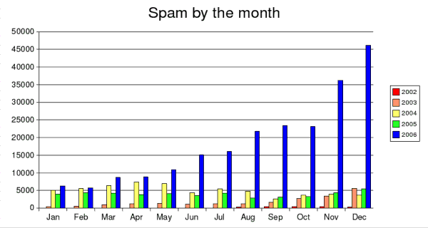
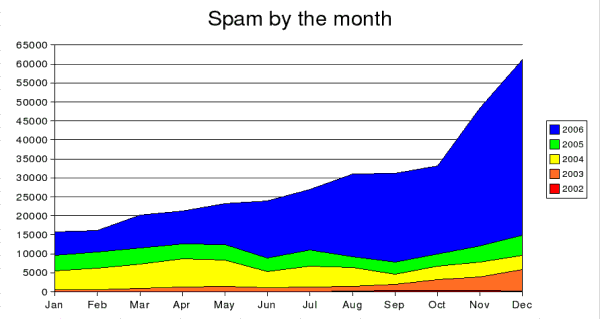
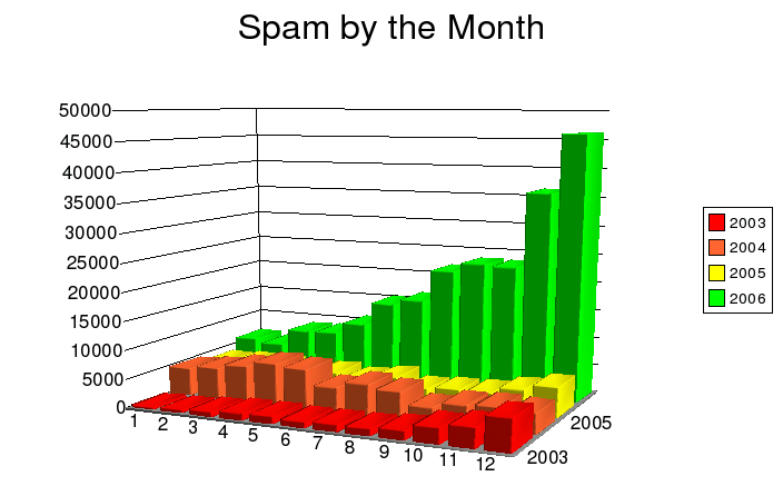
| The Spam Table page has automated, although admittedly less pretty, versions of these data. That page gets updated regularly. |
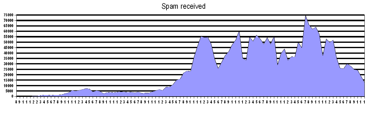
This plots the number of spam received per month, starting from August 2002 and running up to December 2010. The recent decline is most welcome, and it would be interesting to know what's caused it. Certainly the press has mentioned the breaking of botnets, but I also wonder if the advent of Windows 7 and its continuing adoption has helped.
Pure speculation.
Interesting ...
See http://www.paulgraham.com/spam.html for more information about Bayesian filters.
ContentsThere were no headingsin the main text so there is no table of contents. |
Links on this page |
|
 Suggest a change ( <--
What does this mean?) /
Send me email
Suggest a change ( <--
What does this mean?) /
Send me email|
|
Quotation from Tim Berners-Lee |
|